




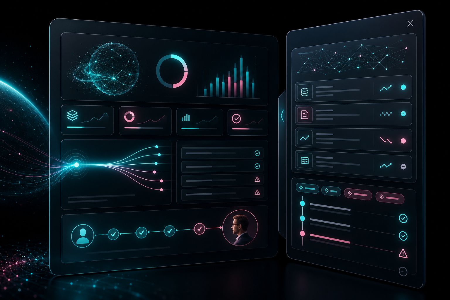
AI summaries are becoming the default shortcut inside SaaS dashboards. They appear in CRM timelines, finance reports, health workflows, analytics products, support tools, and internal operations platforms.
The promise is simple: less scanning, faster decisions, fewer tabs, cleaner workflows.
But there is a UX problem many teams are underestimating: a confident summary is not the same thing as a trustworthy interface.
In complex B2B products, the summary is only the visible layer. The real product experience is the trust layer around it: where the answer came from, what changed, what the AI assumed, what the user can verify, and what happens if the next action is wrong.
That is why AI summaries need evidence panels — not just confidence scores.
Why Confidence Scores Are Not Enough
A confidence score can be useful, but it often answers the wrong question.
Users do not only ask: “How sure is the system?”
- Which data did this use?
- What changed since the last view?
- Is this based on fresh or stale information?
- What is the AI assuming?
- What happens if I approve this action?
- Can I undo it?
- Who will see the result?
- Will this create compliance, financial, or operational risk?
A percentage cannot carry all of that context.
In sensitive workflows, a polished sentence can make users trust the wrong thing faster. That is especially dangerous in fintech, healthtech, revenue operations, compliance, and analytics products where one click can change money movement, patient prioritization, customer outreach, or executive reporting.
The Evidence Panel Pattern
The evidence panel is a companion UI layer next to the AI summary. It does not replace the summary. It makes the summary inspectable.
A strong evidence panel usually includes:
- Sources: the records, documents, metrics, conversations, or systems used to generate the summary.
- Timestamp: when the data was pulled and whether it is fresh enough for the decision.
- Data deltas: what changed since the previous period, view, forecast, or state.
- Assumptions: where the AI filled gaps, inferred intent, or compressed uncertainty.
- Limits: what the AI does not know, cannot verify, or should not be used for.
- Action history: what was approved, rejected, changed, escalated, or undone.
- Safe next steps: approve, compare, open source, ask for review, undo, or escalate.

This turns AI from “black-box answer” into a workflow users can inspect and control.
Fintech Example: Revenue Anomaly Summary
Imagine a fintech or revenue analytics dashboard summarizing a sudden cash-flow change:
Projected net cash dropped 14% this week due to delayed enterprise invoices and higher vendor payouts.
That sentence is useful, but it is not enough.
A finance user needs to see which invoices changed, when vendor payouts were updated, whether the forecast includes disputed payments, and whether the AI compared the right period. They may need to approve an action, flag the forecast for review, or explain the change to leadership.
Without an evidence panel, the user must either trust the sentence blindly or manually recreate the analysis.
With an evidence panel, the summary becomes a decision surface.
Healthtech Example: Workload or Risk Summary
In healthtech, the stakes are even more obvious.
If an AI summary says a patient group or operational queue has become higher risk, the interface must show what contributed to that classification. Was it a new lab result? A missed appointment? A staffing constraint? A change in triage rules? A stale integration?
A vague “high confidence” badge does not help a clinician, coordinator, or operations lead understand what to do next.
They need provenance, recency, escalation paths, and a clear separation between AI suggestion and human decision.
The UX Checklist for Trustworthy AI Summaries
Before shipping AI summaries in a dashboard, product teams should audit six questions.
1. Can users explain the summary?
If a user cannot explain the AI output to a teammate, manager, client, auditor, or patient, the interface is not trustworthy yet.
2. Can users compare the source data?
Give users a path from summary to source. They should not have to open five tabs to verify one generated sentence.
3. Can users see what changed?
Most operational decisions are driven by deltas, not static facts. Show the before/after, not only the current state.
4. Can users separate fact from assumption?
AI often compresses uncertainty. The UI should expose inferred parts of the answer instead of presenting everything with equal certainty.
5. Can users act safely?
Approvals, handoffs, notifications, exports, and money/data-related actions need friction in the right places. Fast is good. Unrecoverable is not.
6. Can users recover?
Undo, rollback, audit trail, and escalation are not edge cases. They are trust infrastructure.

The Business Case
Evidence panels are not just about responsible design. They affect adoption.
When users cannot verify AI output, they either avoid the feature or over-trust it. Both are bad.
Avoidance creates wasted product investment. Over-trust creates support tickets, rework, compliance anxiety, and broken internal confidence.
A better trust layer helps teams reduce blind approvals, shorten verification time, and make AI features feel useful inside real work — not just impressive in a demo.
Heeeper POV
The next AI UX moat is not the prompt box. It is the trust infrastructure around the answer.
For SaaS, fintech, healthtech, and analytics products, the winning AI interfaces will not simply summarize more. They will help users understand, verify, approve, undo, and escalate with confidence.
If your product is adding AI summaries, audit the trust layer before launch.
Heeeper helps B2B teams design complex dashboards, AI workflows, and product interfaces where users can make decisions with confidence — not just faster clicks.
Want a second pair of eyes on your AI feature UX? Book a free UX/UI consultation with Heeeper or request an AI feature UX audit.