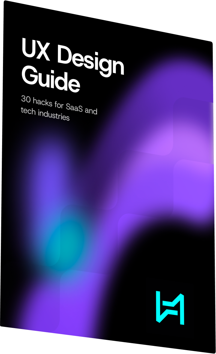


Get the free guide

Free SaaS UX Design Checklist — enter your details and we’ll send the PDF and follow up if you need help applying it.

TradeSpot

Marketplace designed for safer digital trading

TradeSpot - Online Marketplace Design

TradeSpot is an inclusive online marketplace that connects buyers and sellers across products and services. The platform needed a digital experience that could feel accessible, trustworthy, and visually distinct while supporting safe trading, reliable support, and clear marketplace actions.

Start Similar Project

Challenge:

Marketplace products need to handle discovery, trust, account flows, listings, and transactions without overwhelming users. TradeSpot needed a clear website and mobile experience that could make trading feel simple, secure, and approachable for different user groups.

What We Did:

We designed the UI/UX, website system, mobile adaptation, logotype, graphic language, and motion direction around a high-contrast purple identity. The result is a marketplace experience that communicates confidence while keeping product discovery and user actions easy to follow.

  • 1 +

    Unified marketplace journey

  • 2 +

    Responsive trading experiences

  • 1 +

    Trust-focused visual system

Marketplace Foundation

The foundation of TradeSpot is a marketplace story built around access, safety, and clarity. The design makes the platform feel open to different products and services while keeping trust signals, support, and trading actions visible.

Web Platform

The desktop experience combines an expressive hero, product discovery, marketplace content blocks, and conversion-focused states. Each screen balances energy with clear structure so buyers and sellers can understand the value before taking action.

Responsive Trading Experience

On mobile, TradeSpot becomes a focused marketplace path for browsing, account activity, and trading actions. The responsive system keeps content compact while preserving the brand's bold visual language and product confidence.

Style Guide

The style guide uses Darker Grotesque, DM Sans, a dark neutral base, warm off-white surfaces, vivid purple, and lime accents. This gives the marketplace a recognizable identity while keeping interface content readable and practical.

5.0

“Heeeper is a go-to team for Web app design and Mobile UI Design. Their approach to User Experience Design ensures every interaction feels intuitive. The Figma files they delivered were well-organized, and their Prototyping skills made the development handoff seamless. If you're…”

Nathan F.

Upwork

Let’s make your project glow

Contact us to discuss business opportunities or to say hello.

4.9
110+ Clients

Our team will get back to you within 24h